Hank’s Juiciest Beef Burger
- Time
- 20m
- Difficulty
- · Easy
- Servings
- · 4 servings
- By
- Hank Douglas
A utility-first CSS framework packed with classes like flex, pt-4, text-center and rotate-90 that can be composed to build any design, directly in your markup.

Sarah Dayan
Staff Engineer, Algolia
<figure class="md:flex bg-gray-100 rounded-xl p-8 md:p-0">
<img class="w-32 h-32 md:w-48 md:h-auto md:rounded-none rounded-full mx-auto" src="/sarah-dayan.jpg" alt="" width="384" height="512">
<div class="pt-6 md:p-8 text-center md:text-left space-y-4">
<blockquote>
<p class="text-lg font-semibold">
“Tailwind CSS is the only framework that I've seen scale
on large teams. It’s easy to customize, adapts to any design,
and the build size is tiny.”
</p>
</blockquote>
<figcaption class="font-medium">
<div class="text-cyan-600">
Sarah Dayan
</div>
<div class="text-gray-500">
Staff Engineer, Algolia
</div>
</figcaption>
</div>
</figure>
I’ve written a few thousand words on why traditional “semantic class names” are the reason CSS is hard to maintain, but the truth is you’re never going to believe me until you actually try it. If you can suppress the urge to retch long enough to give it a chance, I really think you'll wonder how you ever worked with CSS any other way.

I feel like an idiot for not using Tailwind CSS until now.

If I had to recommend a way of getting into programming today, it would be HTML + CSS with Tailwind CSS.

I have no design skills and with Tailwind I can actually make good looking websites with ease and it's everything I ever wanted in a CSS framework.

I started using @tailwindcss. I instantly fell in love with their responsive modifiers, thorough documentation, and how easy it was customizing color palettes.

Loved it the very moment I used it.

I came into my job wondering why the last dev would ever implement Tailwind into our projects, within days I was a Tailwind convert and use it for all of my personal projects.

There’s one thing that sucks about @tailwindcss - once you’ve used it on a handful of projects it is a real pain in the ass to write normal CSS again.

Okay, I’m officially *all* in on the @tailwindcss hype train. Never thought building websites could be so ridiculously fast and flexible.

Have been working with CSS for over ten years and Tailwind just makes my life easier. It is still CSS and you use flex, grid, etc. but just quicker to write and maintain.

Okay, @tailwindcss just clicked for me and now I feel like a #!@%&$% idiot.

I've been using @tailwindcss the past few months and it's amazing. I already used some utility classes before, but going utility-first... this is the way.

After finally getting to use @tailwindcss on a real client project in the last two weeks I never want to write CSS by hand again. I was a skeptic, but the hype is real.

I didn't think I was going to like @tailwindcss... spent a day using it for a POC, love it! I wish this had been around when we started our company design system, seriously considering a complete rebuild

@tailwindcss looked unpleasant at first, but now I’m hooked on it.

An API for your design system.
Utility classes help you work within the constraints of a system instead of littering your stylesheets with arbitrary values. They make it easy to be consistent with color choices, spacing, typography, shadows, and everything else that makes up a well-engineered design system.
Learn more -><ul class="space-y-4"> <li> <div class="w-64 h-3 bg-gradient-to-br from-fuchsia-500 to-purple-600"></div> </li> <li> <div class="w-56 h-3 bg-gradient-to-br from-fuchsia-500 to-purple-600"></div> </li> <li> <div class="w-48 h-3 bg-gradient-to-br from-fuchsia-500 to-purple-600"></div> </li> <li> <div class="w-40 h-3 bg-gradient-to-br from-fuchsia-500 to-purple-600"></div> </li> <li> <div class="w-32 h-3 bg-gradient-to-br from-fuchsia-500 to-purple-600"></div> </li> <li> <div class="w-24 h-3 bg-gradient-to-br from-fuchsia-500 to-purple-600"></div> </li> <li> <div class="w-20 h-3 bg-gradient-to-br from-fuchsia-500 to-purple-600"></div> </li> <li> <div class="w-16 h-3 bg-gradient-to-br from-fuchsia-500 to-purple-600"></div> </li> <li> <div class="w-12 h-3 bg-gradient-to-br from-fuchsia-500 to-purple-600"></div> </li> <li> <div class="w-10 h-3 bg-gradient-to-br from-fuchsia-500 to-purple-600"></div> </li></ul>Build whatever you want, seriously.
Because Tailwind is so low-level, it never encourages you to design the same site twice. Even with the same color palette and sizing scale, it's easy to build the same component with a completely different look in the next project.
Get started -><div class="flex">
<div class="flex-none w-48 relative">
<img src="/classic-utility-jacket.jpg" alt="" class="absolute inset-0 w-full h-full object-cover" />
</div>
<form class="flex-auto p-6">
<div class="flex flex-wrap">
<h1 class="flex-auto text-xl font-semibold">
Classic Utility Jacket
</h1>
<div class="text-xl font-semibold text-gray-500">
$110.00
</div>
<div class="w-full flex-none text-sm font-medium text-gray-500 mt-2">
In stock
</div>
</div>
<div class="flex items-baseline mt-4 mb-6">
<div class="space-x-2 flex">
<label>
<input class="w-9 h-9 flex items-center justify-center bg-gray-100 rounded-lg" name="size" type="radio" value="xs" checked>
XS
</label>
<label>
<input class="w-9 h-9 flex items-center justify-center" name="size" type="radio" value="s">
S
</label>
<label>
<input class="w-9 h-9 flex items-center justify-center" name="size" type="radio" value="m">
M
</label>
<label>
<input class="w-9 h-9 flex items-center justify-center" name="size" type="radio" value="l">
L
</label>
<label>
<input class="w-9 h-9 flex items-center justify-center" name="size" type="radio" value="xl">
XL
</label>
</div>
<div class="ml-auto text-sm text-gray-500 underline">Size Guide</div>
</div>
<div class="flex space-x-3 mb-4 text-sm font-medium">
<div class="flex-auto flex space-x-3">
<button class="w-1/2 flex items-center justify-center rounded-md bg-black text-white" type="submit">Buy now</button>
<button class="w-1/2 flex items-center justify-center rounded-md border border-gray-300" type="button">Add to bag</button>
</div>
<button class="flex-none flex items-center justify-center w-9 h-9 rounded-md text-gray-400 border border-gray-300" type="button" aria-label="like">
<svg width="20" height="20" fill="currentColor">
<path fill-rule="evenodd" clip-rule="evenodd" d="M3.172 5.172a4 4 0 015.656 0L10 6.343l1.172-1.171a4 4 0 115.656 5.656L10 17.657l-6.828-6.829a4 4 0 010-5.656z" />
</svg>
</button>
</div>
<p class="text-sm text-gray-500">
Free shipping on all continental US orders.
</p>
</form>
</div>
It’s tiny in production.
Tailwind automatically removes all unused CSS when building for production, which means your final CSS bundle is the smallest it could possibly be. In fact, most Tailwind projects ship less than 10kB of CSS to the client.
Learn more -><div class="fixed inset-0 flex items-end justify-center px-4 py-6 pointer-events-none sm:p-6 sm:items-start sm:justify-end">
<div class="max-w-sm w-full bg-white shadow-lg rounded-lg pointer-events-auto">
<div class="rounded-lg shadow-xs overflow-hidden">
<div class="p-4">
<div class="flex items-start">
<div class="flex-shrink-0">
<svg class="h-6 w-6 text-green-400" xmlns="http://www.w3.org/2000/svg" fill="none" viewBox="0 0 24 24" stroke="currentColor">
<path stroke-linecap="round" stroke-linejoin="round" stroke-width="2" d="M9 12l2 2 4-4m6 2a9 9 0 11-18 0 9 9 0 0118 0z" />
</svg>
</div>
<div class="ml-3 w-0 flex-1 pt-0.5">
<p class="text-sm font-medium text-gray-900">
Successfully saved!
</p>
<p class="mt-1 text-sm text-gray-500">
Anyone with a link can now view this file.
</p>
</div>
<div class="ml-4 flex-shrink-0 flex">
<button class="inline-flex text-gray-400 focus:outline-none focus:text-gray-500 transition ease-in-out duration-150">
<svg class="h-5 w-5" xmlns="http://www.w3.org/2000/svg" viewBox="0 0 20 20" fill="currentColor">
<path fill-rule="evenodd" d="M4.293 4.293a1 1 0 011.414 0L10 8.586l4.293-4.293a1 1 0 111.414 1.414L11.414 10l4.293 4.293a1 1 0 01-1.414 1.414L10 11.414l-4.293 4.293a1 1 0 01-1.414-1.414L8.586 10 4.293 5.707a1 1 0 010-1.414z" clip-rule="evenodd" />
</svg>
</button>
</div>
</div>
</div>
</div>
</div>
</div>
Responsive everything.
Wrestling with a bunch of complex media queries in your CSS sucks, so Tailwind lets you build responsive designs right in your HTML instead.
Throw a screen size in front of literally any utility class and watch it magically apply at a specific breakpoint.
Entire house
 Hosted by Kevin Francis


<div class="grid grid-cols-1 sm:grid-cols-2 sm:px-8 sm:py-12 sm:gap-x-8 md:py-16"> <div class="relative z-10 col-start-1 row-start-1 px-4 pt-40 pb-3 bg-gradient-to-t from-black sm:bg-none"> <p class="text-sm font-medium text-white sm:mb-1 sm:text-gray-500">Entire house</p> <h2 class="text-xl font-semibold text-white sm:text-2xl sm:leading-7 sm:text-black md:text-3xl">Beach House in Collingwood</h2> </div> <div class="col-start-1 row-start-2 px-4 sm:pb-16"> <div class="flex items-center text-sm font-medium my-5 sm:mt-2 sm:mb-4"> <svg width="20" height="20" fill="currentColor" class="text-violet-600"> <path d="M9.05 3.691c.3-.921 1.603-.921 1.902 0l1.07 3.292a1 1 0 00.95.69h3.462c.969 0 1.372 1.24.588 1.81l-2.8 2.034a1 1 0 00-.364 1.118l1.07 3.292c.3.921-.755 1.688-1.539 1.118l-2.8-2.034a1 1 0 00-1.176 0l-2.8 2.034c-.783.57-1.838-.197-1.539-1.118l1.07-3.292a1 1 0 00-.363-1.118l-2.8-2.034c-.784-.57-.381-1.81.587-1.81H7.03a1 1 0 00.95-.69L9.05 3.69z" /> </svg> <div class="ml-1"> <span class="text-black">4.94</span> <span class="sm:hidden md:inline">(128)</span> </div> <div class="text-base font-normal mx-2">·</div> <div>Collingwood, Ontario</div> </div> <hr class="w-16 border-gray-300 hidden sm:block"> </div> <div class="col-start-1 row-start-3 space-y-3 px-4"> <p class="flex items-center text-black text-sm font-medium"> <img src="/kevin-francis.jpg" alt="" class="w-6 h-6 rounded-full mr-2 bg-gray-100"> Hosted by Kevin Francis </p> <button type="button" class="bg-violet-100 text-violet-700 text-base font-semibold px-6 py-2 rounded-lg">Check availability</button> </div> <div class="col-start-1 row-start-1 flex sm:col-start-2 sm:row-span-3"> <div class="w-full grid grid-cols-3 grid-rows-2 gap-2"> <div class="relative col-span-3 row-span-2 md:col-span-2"> <img src="/beach-house.jpg" alt="" class="absolute inset-0 w-full h-full object-cover bg-gray-100 sm:rounded-lg" /> </div> <div class="relative hidden md:block"> <img src="/beach-house-interior.jpg" alt="" class="absolute inset-0 w-full h-full object-cover rounded-lg bg-gray-100" /> </div> <div class="relative hidden md:block"> <img src="/beach-house-view.jpg" alt="" class="absolute inset-0 w-full h-full object-cover rounded-lg bg-gray-100" /> </div> </div> </div></div>Hover and focus states? We got ’em.
Want to style something on hover? Stick hover: at the beginning of the class you want to add. Works for focus, active, disabled, focus-within, focus-visible, and even fancy states we invented ourselves like group-hover.
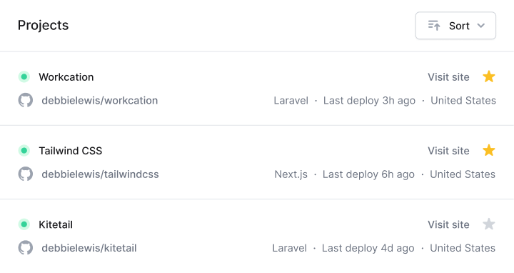
<section class="px-4 sm:px-6 lg:px-4 xl:px-6 pt-4 pb-4 sm:pb-6 lg:pb-4 xl:pb-6 space-y-4"> <header class="flex items-center justify-between"> <h2 class="text-lg leading-6 font-medium text-black">Projects</h2> <button class="hover:bg-light-blue-200 hover:text-light-blue-800 group flex items-center rounded-md bg-light-blue-100 text-light-blue-600 text-sm font-medium px-4 py-2"> <svg class="group-hover:text-light-blue-600 text-light-blue-500 mr-2" width="12" height="20" fill="currentColor"> <path fill-rule="evenodd" clip-rule="evenodd" d="M6 5a1 1 0 011 1v3h3a1 1 0 110 2H7v3a1 1 0 11-2 0v-3H2a1 1 0 110-2h3V6a1 1 0 011-1z"/> </svg> New </button> </header> <form class="relative"> <svg width="20" height="20" fill="currentColor" class="absolute left-3 top-1/2 transform -translate-y-1/2 text-gray-400"> <path fill-rule="evenodd" clip-rule="evenodd" d="M8 4a4 4 0 100 8 4 4 0 000-8zM2 8a6 6 0 1110.89 3.476l4.817 4.817a1 1 0 01-1.414 1.414l-4.816-4.816A6 6 0 012 8z" /> </svg> <input class="focus:border-light-blue-500 focus:ring-1 focus:ring-light-blue-500 focus:outline-none w-full text-sm text-black placeholder-gray-500 border border-gray-200 rounded-md py-2 pl-10" type="text" aria-label="Filter projects" placeholder="Filter projects" /> </form> <ul class="grid grid-cols-1 sm:grid-cols-2 lg:grid-cols-1 xl:grid-cols-2 gap-4"> <li x-for="item in items"> <a :href="item.url" class="hover:bg-light-blue-500 hover:border-transparent hover:shadow-lg group block rounded-lg p-4 border border-gray-200"> <dl class="grid sm:block lg:grid xl:block grid-cols-2 grid-rows-2 items-center"> <div> <dt class="sr-only">Title</dt> <dd class="group-hover:text-white leading-6 font-medium text-black"> {item.title} </dd> </div> <div> <dt class="sr-only">Category</dt> <dd class="group-hover:text-light-blue-200 text-sm font-medium sm:mb-4 lg:mb-0 xl:mb-4"> {item.category} </dd> </div> <div class="col-start-2 row-start-1 row-end-3"> <dt class="sr-only">Users</dt> <dd class="flex justify-end sm:justify-start lg:justify-end xl:justify-start -space-x-2"> <img x-for="user in item.users" :src="user.avatar" :alt="user.name" width="48" height="48" class="w-7 h-7 rounded-full bg-gray-100 border-2 border-white" /> </dd> </div> </dl> </a> </li> <li class="hover:shadow-lg flex rounded-lg"> <a href="/new" class="hover:border-transparent hover:shadow-xs w-full flex items-center justify-center rounded-lg border-2 border-dashed border-gray-200 text-sm font-medium py-4"> New Project </a> </li> </ul></section>Worried about duplication? Don’t be.
If you're repeating the same utilities over and over and over again, all you have to do is extract them into a component or template partial and boom — you've got a single source of truth so you can make changes in one place.
Learn more ->


import Nav from ''
import NavItem from ''
import List from ''
import ListItem from ''
export default function Recipes({ recipes }) {
return (
<div className="divide-y divide-gray-100">
<Nav>
<NavItem href="/featured" isActive>Featured</NavItem>
<NavItem href="/popular">Popular</NavItem>
<NavItem href="/recent">Recent</NavItem>
</Nav>
<List>
{recipes.map((recipe) => (
<ListItem key={recipe.id} recipe={recipe} />
))}
</List>
</div>
)
}
Not into component frameworks and like to keep it old school? Use Tailwind's @apply directive to extract repeated utility patterns into custom CSS classes just by copying and pasting the list of class names.
Learn more ->.btn {
@apply text-base font-medium rounded-lg p-3;
}
.btn--primary {
@apply bg-rose-500 text-white;
}
.btn--secondary {
@apply bg-gray-100 text-black;
}
</dd> </div> </dl> <footer class="grid grid-cols-2 gap-x-6"> <button class="btn btn--secondary">Decline</button> <button class="btn btn--primary">Accept</button> </footer></article>Now with Dark Mode.
Don’t want to be one of those websites that blinds people when they open it on their phone at 2am? Enable dark mode in your configuration file then throw dark: in front of any color utility to apply it when dark mode is active. Works for background colors, text colors, border colors, and even gradients.

Ep. 128
Full Stack Radio
<div class="bg-white dark:bg-gray-800 rounded-tl-xl sm:rounded-t-xl p-4 pb-6 sm:p-8 lg:p-4 lg:pb-6 xl:p-8 space-y-6 sm:space-y-8 lg:space-y-6 xl:space-y-8">
<div class="flex items-center space-x-3.5 sm:space-x-5 lg:space-x-3.5 xl:space-x-5">
<img src="/full-stack-radio.png" alt="" width="160" height="160" class="flex-none w-20 h-20 rounded-lg bg-gray-100" />
<div class="min-w-0 flex-auto space-y-0.5">
<p class="text-lime-600 dark:text-lime-400 text-sm sm:text-base lg:text-sm xl:text-base font-semibold uppercase">
<abbr title="Episode">Ep.</abbr> 128
</p>
<h2 class="text-black dark:text-white text-base sm:text-xl lg:text-base xl:text-xl font-semibold truncate">
Scaling CSS at Heroku with Utility Classes
</h2>
<p class="text-gray-500 dark:text-gray-400 text-base sm:text-lg lg:text-base xl:text-lg font-medium">
Full Stack Radio
</p>
</div>
</div>
<div class="space-y-2">
<div class="bg-gray-200 dark:bg-black rounded-full overflow-hidden">
<div class="bg-lime-500 dark:bg-lime-400 w-1/2 h-1.5" role="progressbar" aria-valuenow="1456" aria-valuemin="0" aria-valuemax="4550"></div>
</div>
<div class="text-gray-500 dark:text-gray-400 flex justify-between text-sm font-medium tabular-nums">
<div>24:16</div>
<div>75:50</div>
</div>
</div>
</div>
<div class="bg-gray-50 text-black dark:bg-gray-900 dark:text-white lg:rounded-b-xl py-4 px-1 sm:px-3 lg:px-1 xl:px-3 grid grid-cols-5 sm:grid-cols-7 lg:grid-cols-5 xl:grid-cols-7 items-center">
<button type="button" class="mx-auto">
<svg width="24" height="24" fill="none">
<path d="M5 5a2 2 0 012-2h10a2 2 0 012 2v16l-7-3.5L5 21V5z" stroke="currentColor" stroke-width="1.5" stroke-linecap="round" />
</svg>
</button>
<button type="button" class="hidden sm:block lg:hidden xl:block mx-auto">
<svg width="17" height="18">
<path d="M0 0h2v18H0V0zM4 9l13-9v18L4 9z" fill="currentColor" />
</svg>
</button>
<button type="button" class="mx-auto">
<svg width="34" height="39" fill="none">
<path d="M12.878 26.12c1.781 0 3.09-1.066 3.085-2.515.004-1.104-.665-1.896-1.824-2.075v-.068c.912-.235 1.505-.95 1.5-1.93.005-1.283-1.048-2.379-2.727-2.379-1.602 0-2.89.968-2.932 2.387h1.274c.03-.801.784-1.287 1.64-1.287.892 0 1.475.541 1.471 1.346.004.844-.673 1.398-1.64 1.398h-.738v1.074h.737c1.21 0 1.91.614 1.91 1.491 0 .848-.738 1.424-1.765 1.424-.946 0-1.683-.486-1.734-1.262H9.797c.055 1.424 1.317 2.395 3.08 2.395zm7.734.025c2.016 0 3.196-1.645 3.196-4.504 0-2.838-1.197-4.488-3.196-4.488-2.003 0-3.196 1.645-3.2 4.488 0 2.855 1.18 4.5 3.2 4.504zm0-1.138c-1.18 0-1.892-1.185-1.892-3.366.004-2.174.716-3.371 1.892-3.371 1.172 0 1.888 1.197 1.888 3.37 0 2.182-.712 3.367-1.888 3.367z" fill="currentColor" />
<path d="M1 22c0 8.837 7.163 16 16 16s16-7.163 16-16S25.837 6 17 6" stroke="currentColor" stroke-width="1.5" />
<path d="M17 0L9 6l8 6V0z" fill="currentColor" />
</svg>
</button>
<button type="button" class="mx-auto">
<svg width="50" height="50" fill="none">
<circle class="text-gray-300 dark:text-gray-500" cx="25" cy="25" r="24" stroke="currentColor" stroke-width="1.5" />
<path d="M18 16h4v18h-4V16zM28 16h4v18h-4z" fill="currentColor" />
</svg>
</button>
<button type="button" class="mx-auto">
<svg width="34" height="39" fill="none">
<path d="M12.878 26.12c1.781 0 3.09-1.066 3.085-2.515.004-1.104-.665-1.896-1.824-2.075v-.068c.912-.235 1.505-.95 1.5-1.93.005-1.283-1.048-2.379-2.727-2.379-1.602 0-2.89.968-2.932 2.387h1.274c.03-.801.784-1.287 1.64-1.287.892 0 1.475.541 1.471 1.346.004.844-.673 1.398-1.64 1.398h-.738v1.074h.737c1.21 0 1.91.614 1.91 1.491 0 .848-.738 1.424-1.765 1.424-.946 0-1.683-.486-1.734-1.262H9.797c.055 1.424 1.317 2.395 3.08 2.395zm7.734.025c2.016 0 3.196-1.645 3.196-4.504 0-2.838-1.197-4.488-3.196-4.488-2.003 0-3.196 1.645-3.2 4.488 0 2.855 1.18 4.5 3.2 4.504zm0-1.138c-1.18 0-1.892-1.185-1.892-3.366.004-2.174.716-3.371 1.892-3.371 1.172 0 1.888 1.197 1.888 3.37 0 2.182-.712 3.367-1.888 3.367z" fill="currentColor" />
<path d="M33 22c0 8.837-7.163 16-16 16S1 30.837 1 22 8.163 6 17 6" stroke="currentColor" stroke-width="1.5" />
<path d="M17 0l8 6-8 6V0z" fill="currentColor" />
</svg>
</button>
<button type="button" class="hidden sm:block lg:hidden xl:block mx-auto">
<svg width="17" height="18" viewBox="0 0 17 18" fill="none">
<path d="M17 0H15V18H17V0Z" fill="currentColor" />
<path d="M13 9L0 0V18L13 9Z" fill="currentColor" />
</svg>
</button>
<button type="button" class="mx-auto border border-gray-300 rounded-md text-sm font-medium py-0.5 px-2 text-gray-500 dark:border-gray-600 dark:text-gray-400">
1.0x
</button>
</div>
Extend it, tweak it, change it.
Tailwind includes an expertly crafted set of defaults out-of-the-box, but literally everything can be customized — from the color palette to the spacing scale to the box shadows to the mouse cursor.
Use the tailwind.config.js file to craft your own design system, then let Tailwind transform it into your own custom CSS framework.
module.exports = {
theme: {
fontFamily: {
display: ['Inter', 'system-ui', 'sans-serif'],
body: ['Inter', 'system-ui', 'sans-serif'],
},
colors: {
primary: {
50: '#eef2ff',
100: '#e0e7ff',
200: '#c7d2fe',
300: '#a5b4fc',
400: '#818cf8',
500: '#6366f1',
600: '#4f46e5',
700: '#4338ca',
800: '#3730a3',
900: '#312e81',
},
gray: {
50: '#fafafa',
100: '#f4f4f5',
200: '#e4e4e7',
300: '#d4d4d8',
400: '#a1a1aa',
500: '#71717a',
600: '#52525b',
700: '#3f3f46',
800: '#27272a',
900: '#18181b',
},
},
},
}
Cutting-edge is our comfort zone.
Tailwind is unapologetically modern, and takes advantage of all the latest and greatest CSS features to make the developer experience as enjoyable as possible.
We've got first-class CSS grid support, composable transforms and gradients powered by CSS variables, support for modern state selectors like :focus-visible, and tons more.
<div class="grid grid-flow-col grid-rows-2 grid-cols-3 gap-4">
<div>
1
</div>
<div class="col-start-3">
2
</div>
<div>
3
</div>
<div>
4
</div>
<div class="row-start-1 col-start-2 col-span-2">
5
</div>
</div>
World-class IDE integration.
Worried about remembering all of these class names? The Tailwind CSS IntelliSense extension for VS Code has you covered.
Get intelligent autocomplete suggestions, linting, class definitions and more, all within your editor and with no configuration required.
<div class="w-full flex items-center justify-between block p-6 space-x-6">
<div class="flex-1 truncate">
<div class="flex items-center space-x-3">
<h3 class="text-gray-900 text-sm font-medium truncate">Jane Cooper</h3>
<span class="text-teal-600">Admin</span>
</div>
<p class="mt-1 text-gray-500 text-sm truncate">Regional Paradigm Technician</p>
</div>
<img class="w-10 h-10 bg-gray-300 rounded-full flex-shrink-0" src="https://images.unsplash.com/photo-1494790108377-be9c29b29330?ixlib=rb-1.2.1&ixid=eyJhcHBfaWQiOjEyMDd9&auto=format&fit=facearea&facepad=4&w=256&h=256&q=60" alt="">
</div>
<div class="border-t border-gray-200">
<div class="-mt-px flex">
<div class="w-0 flex-1 flex border-r border-gray-200">
<a href="#" class="relative -mr-px w-0 flex-1 inline-flex items-center justify-center py-4 text-sm text-gray-700 font-medium border border-transparent rounded-bl-lg hover:text-gray-500 focus:outline-none focus:shadow-outline-blue focus:border-blue-300 focus:z-10 transition ease-in-out duration-150">
<svg class="w-5 h-5 text-gray-400" xmlns="http://www.w3.org/2000/svg" viewBox="0 0 20 20" fill="currentColor">
<path d="M2.003 5.884L10 9.882l7.997-3.998A2 2 0 0016 4H4a2 2 0 00-1.997 1.884z" />
<path d="M18 8.118l-8 4-8-4V14a2 2 0 002 2h12a2 2 0 002-2V8.118z" />
</svg>
<span class="ml-3">Email</span>
</a>
</div>
</div>
</div>
'flex' applies the same CSS property as 'block'.
cssConflict [1, 20]
'block' applies the same CSS property as 'flex'.
cssConflict [1, 54]
Move even faster with Tailwind UI.
Tailwind UI is a collection of beautiful, fully responsive UI components, designed and developed by us, the creators of Tailwind CSS. It's got hundreds of ready-to-use examples to choose from, and is guaranteed to help you find the perfect starting point for what you want to build.
Learn more ->


